Patti's logo: what Larry pointed us to, and six directions
From the call on 19 Nov. Larry said to look at the National Nordic Museum, marina logos, and waterfront real estate identities. He said water should be a feature, and "it's not a ballet logo": it has to pull the maritime families, the boaters and the arts into one. Patti said the boats lead, not the wildlife, and the heron is on everything in Seattle, so it can only be a small secondary graphic.
Nothing here has gone to Patti. Pick the directions you like and I'll generate marks for them.
What Larry pointed us to
National Nordic Museum
Two flat shapes make an N, with the name stacked underneath. One color, no ornament. This is the restraint Larry meant. We borrow the attitude, never the teal or the N.

Seattle Yacht Club
A club pennant and spaced capitals. Every boating family flies a burgee, so it reads as "our club" without a word.
Western Towboat
The boat is the logo, drawn as an honest working tug. Patti already visits them.
Seattle Fishermen's Memorial
A Ron Petty sculpture became the logo. It's proof this audience accepts art as the symbol when the art is about them.

Center for Wooden Boats
One boat fills the box. It's friendly and public, a little casual for the gala.
Roche Harbor
Type only, like a carved nameboard. It shows that lettering alone can carry "heritage marina."
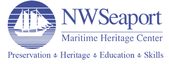
Northwest Seaport
Dignified and historic, but busy and hard to read small. This is the version to avoid.

Terminal One, Salmon Bay
Probably the project Larry meant: Dean Jones's firm (Realogics Sotheby's) is selling it. A gold monogram with thin art deco capitals. This is what money spends on.

The Waterfront Collection
One flowing letter suggests water without drawing a wave.
What the good ones share: one boat or one flag at full size, spaced serif capitals for money and heritage, and one brass or gold accent on navy.
Six directions for Passage to Puget Sound
The Burgee
A pennant for the park itself, in navy and Nordic red, with one thin line across it for the waterline of the canal. The name sits under it in spaced serif capitals. The gala becomes the night the flag goes up, and real flags can fly at the park.
Watch: it must not look like the Seattle Yacht Club's flag.
Bow On
One real Puget Sound working boat in clean profile (a seiner, a tug, or a Nordic double-ender) on a single brass waterline that runs past the bow toward the Sound. The name is stacked in a calm sans, like the museum. This is the most literal "boats lead."
Watch: Patti picks which boat, because the captains will judge it.
The Cut
The Ship Canal from above in three or four strokes: two banks, the channel, a small mark for the Locks, opening to the Sound. Every boat in this audience has gone through the Locks, and "passage" is this exact water. No one else could use it.
Watch: it can't read like a transit map.
The Ship Setting
A boat outline made of standing stones, after the Viking Age stone ships in Scandinavia, taller at bow and stern, on one waterline. It's a boat, a sculpture garden and Nordic heritage in one shape, with no Viking cliché. It also echoes the basalt columns going into the park. This is my strongest answer to "bring the maritime and the arts into one."
Watch: the stones need real weight so it doesn't look like a dotted line.
The Quarterboard
The name carved like the nameboard on a yacht's stern: classic serif capitals, brass on navy, with one sweeping hull line under it. It looks the way their attorneys and banks expect, and it holds up tiny on a check or a donor wall.
Watch: keep ornament out or it turns into a seafood restaurant sign.
Sail and Plinth (optional)
One tall sail standing on a sculpture base, with the top of the base as the waterline. That's sail, sculpture and shoreline in two shapes.
Watch: it sits closest to the museum's N, so it needs a side-by-side check before anyone sees it.
Left out on purpose
- The heron as the main mark
- Wave swooshes and speed lines
- Anchors (they mean "stopped," the opposite of a passage)
- Compass roses and ship wheels
- Rope borders and lighthouses
- Orcas
- Mountain-over-water circles
- Hexagon badges
- The museum's teal or its N
Your call
Which two or three should I generate? My pick: D, the Ship Setting (the strongest idea), A, the Burgee (the club feeling Larry described), and E, the Quarterboard (safe and expensive-looking).
I'll make the marks from these directions and put them on a page like this one for you. Nothing goes to Patti until you pick. The goal is before Thanksgiving.
The full research with sources is in the project at research/logo-2026-11/reference-and-directions.md. Logos are shown here for reference only and never go to Patti.